By Farzana Dudhwala and Thomas Turnbull
Last week Will Stahl-Timmins, an associate research fellow at the European Centre for Environment and Human Health (ECEHH), based at the University of Exeter, presented his thoughts on the visual presentation of data and information.
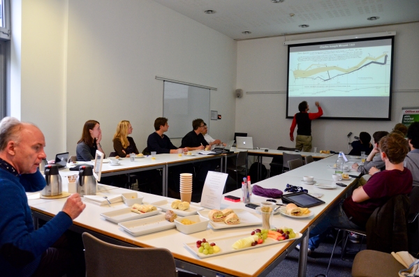
The Counting Differently Working Group in action
From the very first slide we knew we were in for a treat. Despite a flurry of recent interest, Will pointed out that effective visual representation was nothing new. Will showed us a picture of what statistician Edward Tufte has argued is “probably the best statistical graph ever shown”: Charles Joseph Minard’s (1869) depiction of the losses suffered by Napoleon’s army in 1812 . This ‘statistical graph’ is often hailed as a lesson in how visual communication should be done:

Will then showed us another example of presenting data visually. Florence Nightingale’s “Diagram of the Causes of Mortality in the Army of the East” (1858) is often cited as an example of objective data communication. However, as only a graphic design practitioner could, he pointed out how this seemingly ‘objective’ visualisation was in fact tweaked to turn it into a rhetorical device.
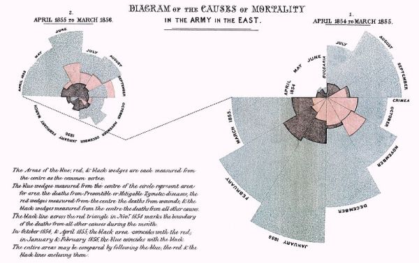
In Nightingale’s diagram, people often assume that the area of the wedge is proportional to the figure it represents, but this is not the case. In fact, the figures are represented by the radius of each piece of the circle – not nearly as intuitive (at least not for people in cultures where the area is the intuitive conclusion rather than the radius). The effect emphasises the extent of disease driven fatalities, at the expense of combat fatalities. Nightingale’s Rose, as the diagram is sometimes known, can certainly mislead; though of course in her case this was done with the best of intentions.
After an informed introduction to the world of visualisation, Will put on his other hat to speak about the role of data visualisation in academia. Often, he explained, his work for the European Centre for Environment and Human Health involves dealing with what he calls ‘excited scientist syndrome'(!). This is the entirely understandable enthusiasm of the expert scientist when they feel they have come across an exciting data-driven insight. Will’s job is to visual render the enthusiasm of the expert in such a way that the non-expert can become equally excited.
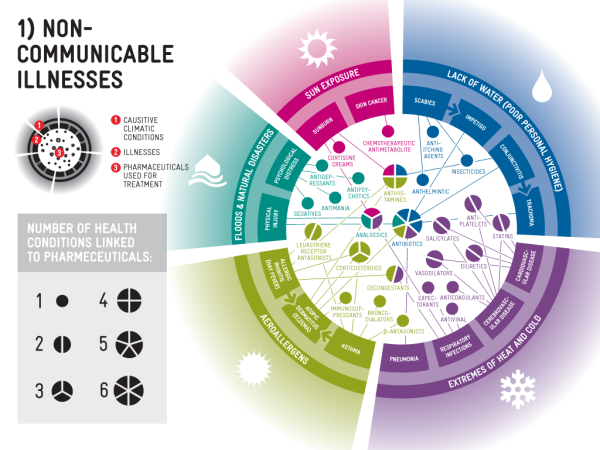
So, when Will received a visit from a colleague suffering from excited scientist syndrome, he was able to translate their enthusiasm about the – as yet undocumented – relationship between climate change and pharmaceutical use into an effective and informationally rich indicator (the paper that came out of this can be found here, and the resulting graphic can be seen below):
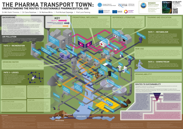
Will also spoke about the ‘Pharma Town‘ project, an attempt to map the flows of pharmaceuticals through the environment. A visualisation he created in the middle of a study acted as a focus point, around which his fellow researchers could direct their expertise, and point out where probable diffusions and flows might, or were known to, occur. They used the visualisation as a tool to think about new ideas and ways of sharing knowledge. In other words, as Will told us, the visualisation revealed hidden connections in the work and allowed them to be brought to the fore. This is very much in line with Michael Lynch’s argument (see below for a link to Lynch’s paper) about how pictures can “transform previously hidden phenomena into visual displays for consensual ‘seeing’ and ‘knowing’” (1988:203).
In another example, Will showed how reams of spreadsheet data can be transformed into icon driven and aesthetically pleasing images, which can convey some of the excitement that the scientist feels in their own work. The images also work as a useful visual heuristic for the scientists themselves. So, for example, a large quantity of clinical trial data can be summarised visually, digested rapidly, and, in some cases, remembered more accurately. Will is looking to automate the visualisation process, which would no doubt be of benefit to busy health professionals.
The flip-side of the visualisation process is assuring that the exciting this rendering still accurately portrays the science which it communicates. So Will’s relationship with the science he translates is based on trust, and his own understanding of the research he conveys.
Further academic robustness comes from the fact that Will and his colleagues are work to empirically test the effectiveness of information visualisation. Using relatively large subject samples, they have empirically tested how effective various forms of visualisation are at appealing to, communicating with, and sticking facts into human brains. Their initial findings seem to point out that for certain demographics visualised data is more appealing, more quickly digested, and better remembered.
Will’s talk, as hoped and expected, sparked a number of interesting questions and discussions. Here is a selection of those that were particularly thought-provoking:
- Does the stage at which a visual representation is produced affect the way the researchers themselves relate to their own data? Does it change the way the report or journal is written or how the conclusions are drawn?
- Are there cultural differences between the way the designs of the visual representations are received by their audiences?
- To what extent is it really possible to represent risk and uncertainty?
- Is a picture more misleading than textual prose because a packaged picture seems to convey some sort of higher truth (much like arguments that have been made in STS about numbers)?
- Do people that make infographics or visualisations have to provide a methodology? Does the creator of the visualisation have to provide a record or justification for what gets counted or what doesn’t get counted in the infographic?
- What would peer review look like for visual science?
Will also kindly gave us a resource list to draw upon if we wanted to find out more about how to create data visualisations ourselves, or if we wanted to see some examples of other people’s visual work.
The two programming languages he mentioned are:
Some useful websites are:
And some conferences too:
And lastly, In case you missed it, we had suggested two readings for the group which are particularly relevant to Will’s talk:
The group will meet again at 12.30pm on November 29th at the Said Business School in Seminar Room 13, where we will welcome Dr Anthony Garnault from the Department of Contemporary China Studies at the University of Oxford. He’ll be talking about social surveys in the twentieth century, and will be questioning what the ‘typical’ represents. We’ll be sending out a couple of suggested readings shortly, so watch this space! (A full list of seminars and activities can be found here).